.svg)
Ergo Concept: modernising a historic brand without losing its DNA


Écrit par
Mathilde Bréhaut
Designer chez Design Elite
Mise à jour le
June 7, 2026
min
The challenge: to challenge an existing image while respecting the foundations
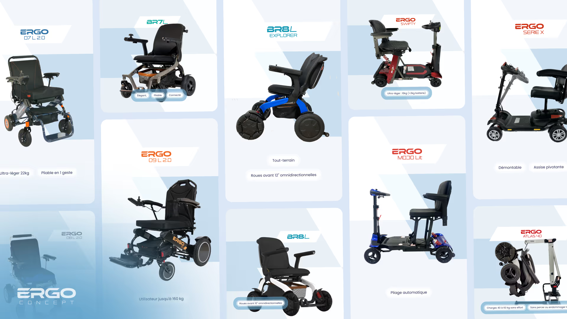
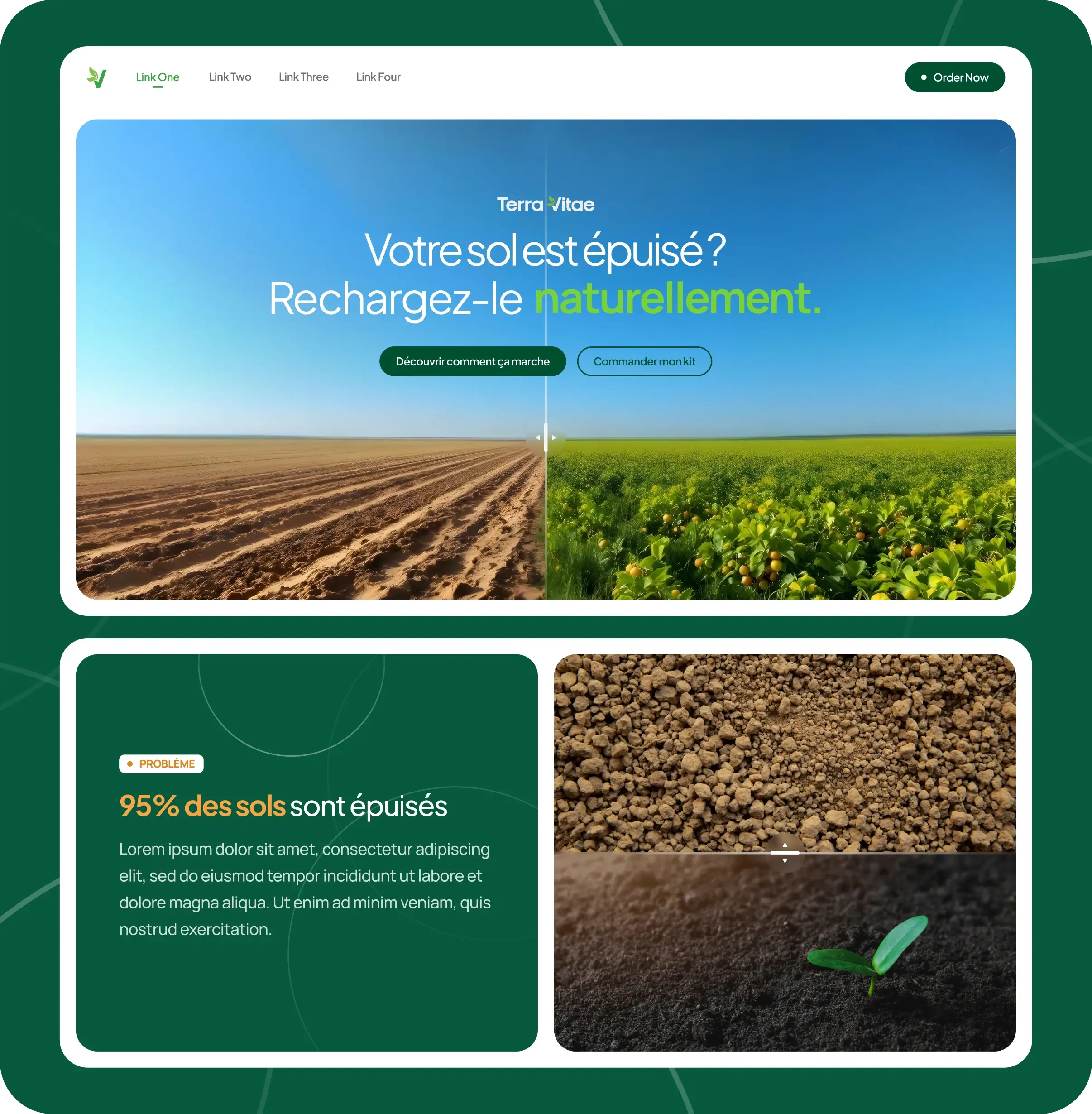
Ergo Concept is a French company specialized in the design and sale of foldable electric wheelchairs and scooters.
Their mission: to offer mobility solutions that are practical, efficient and elegant at the same time, to improve the quality of life of people with reduced mobility.When they contact us, their need is clear: Challenging the existing.
The graphic identity, the logo, the organization of the content on the site, the presentation of the products... everything deserved to be redesigned with a fresh eye. Seduced by our advertising campaigns, they immediately opted for our Elite subscription.
Their communication team is already in place, so our role is to come support and streamline their design production, helping them to go faster and further in modernizing their image, without sacrificing any of the strong identity they had already built over several years.


Unlimited requests, fast results
Submit as many briefs as you need. Our plans allow you to manage a continuous flow of design requests, without limits and without friction, and at an economic cost.

Our mission: modernise without altering
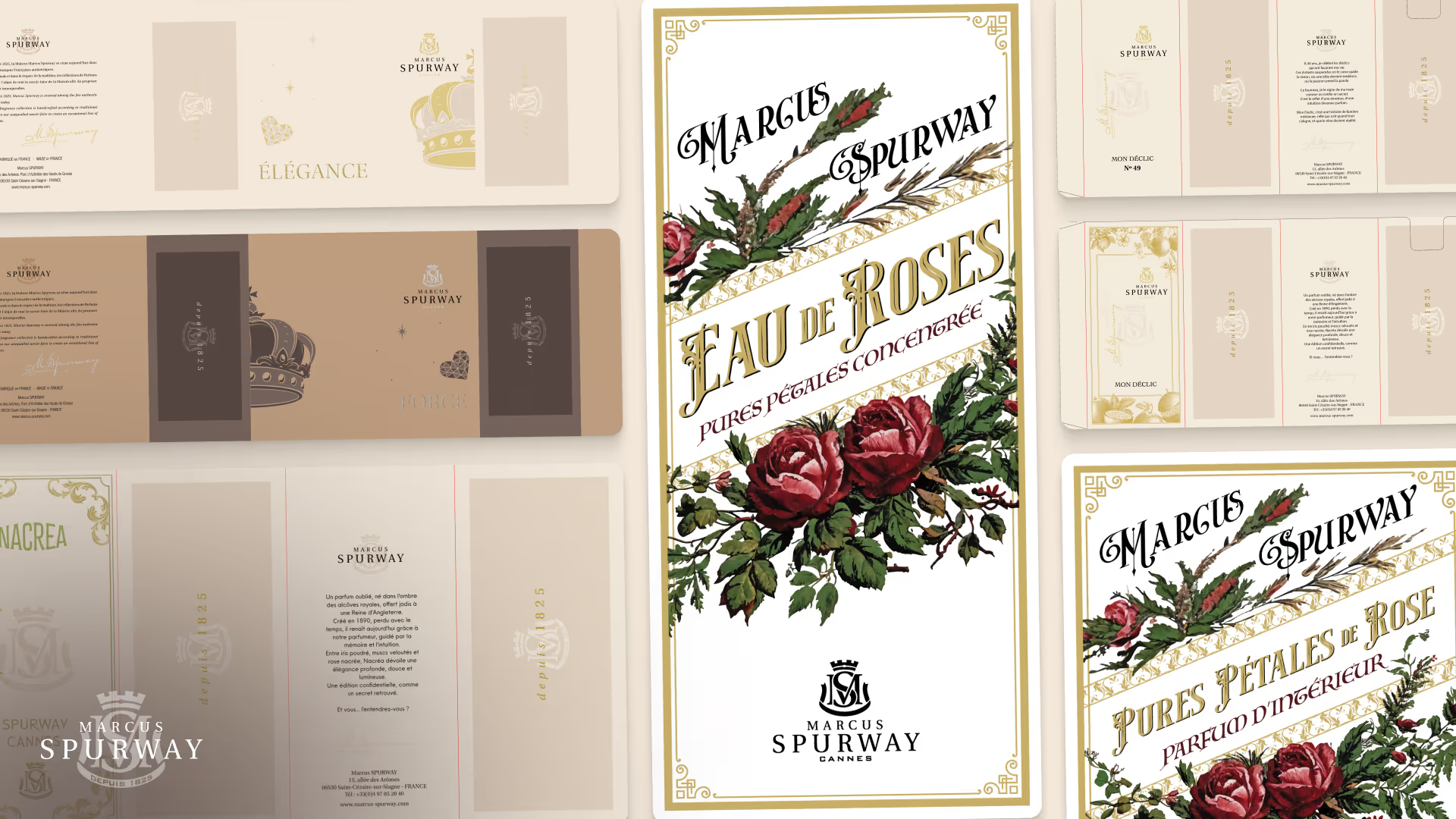
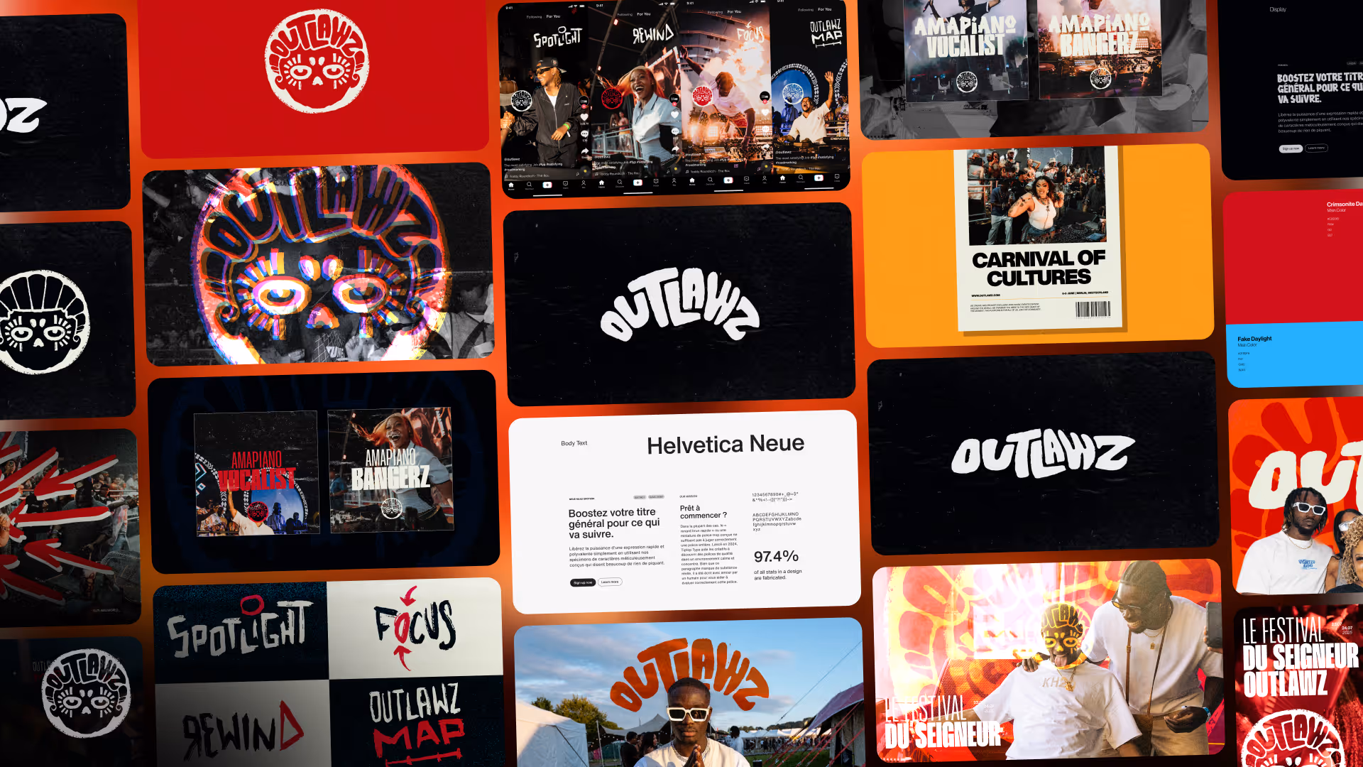
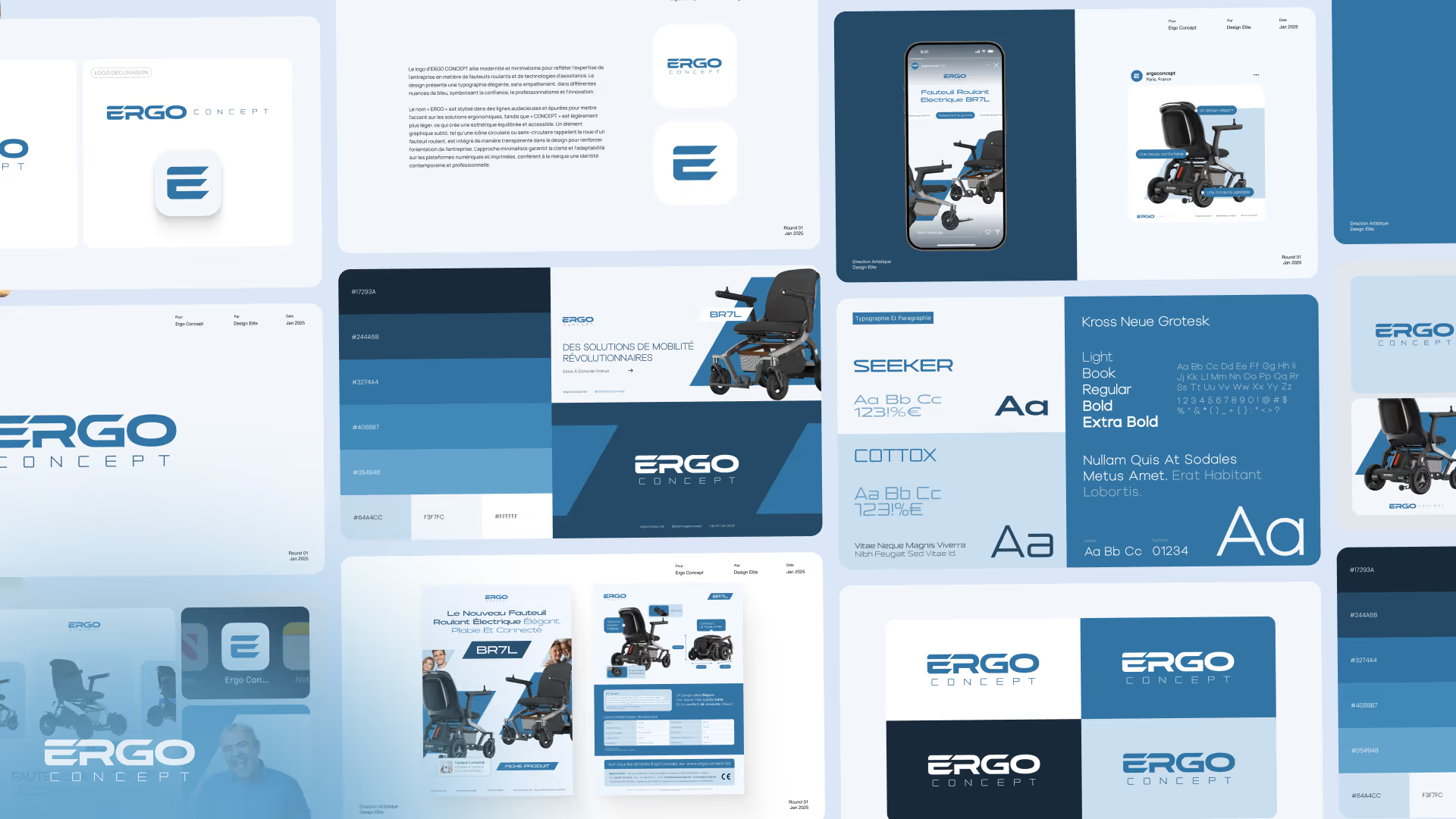
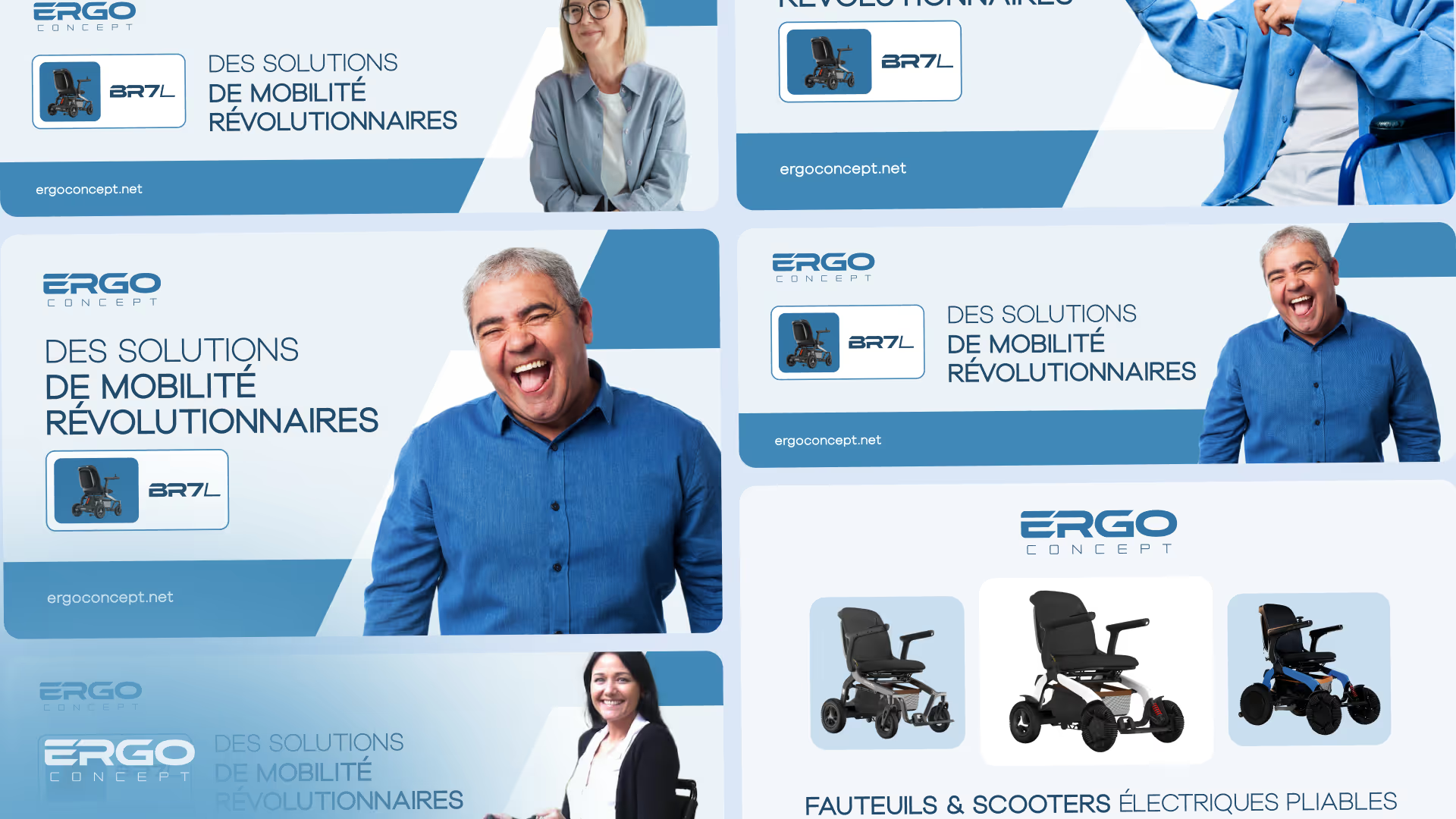
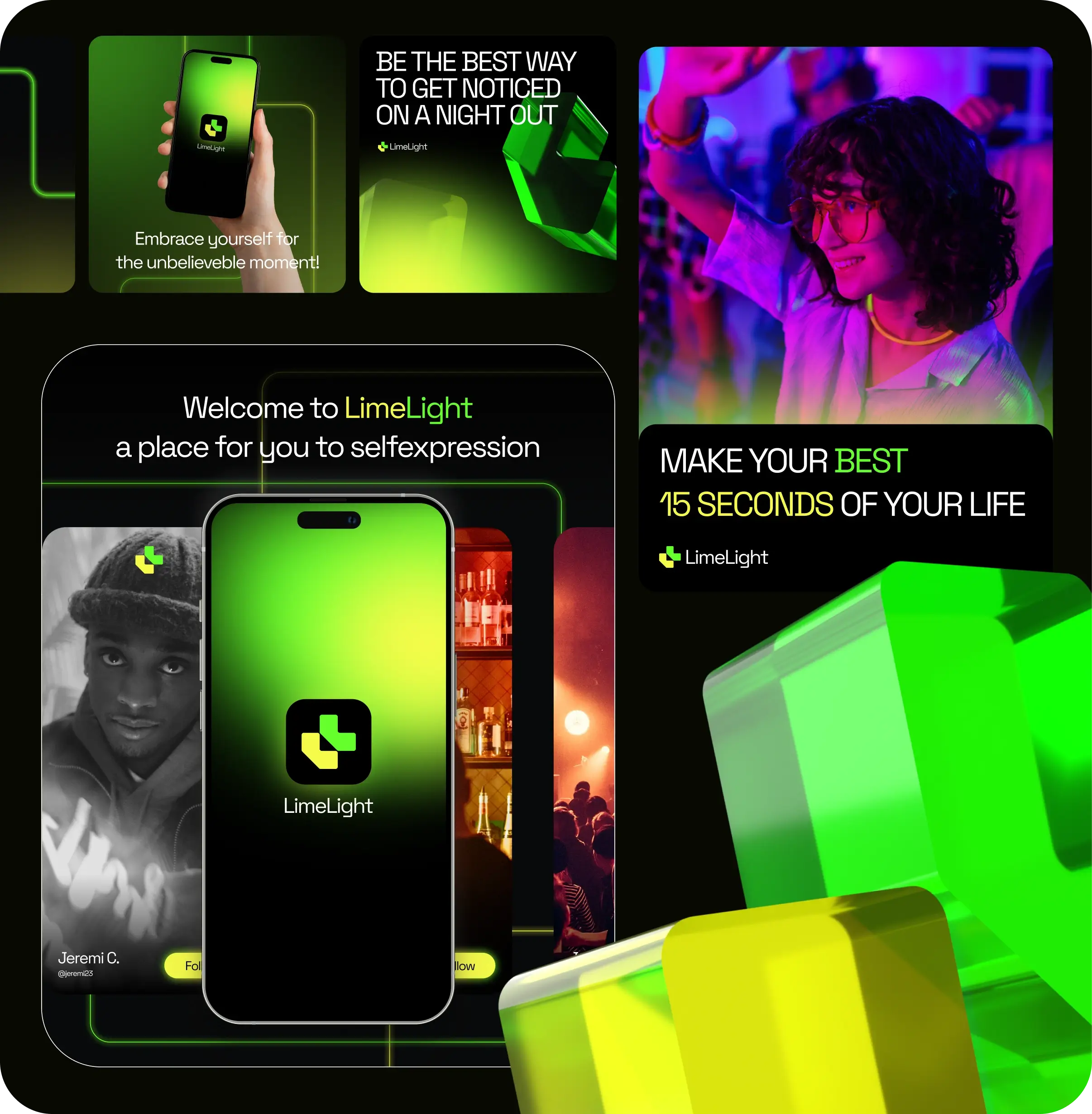
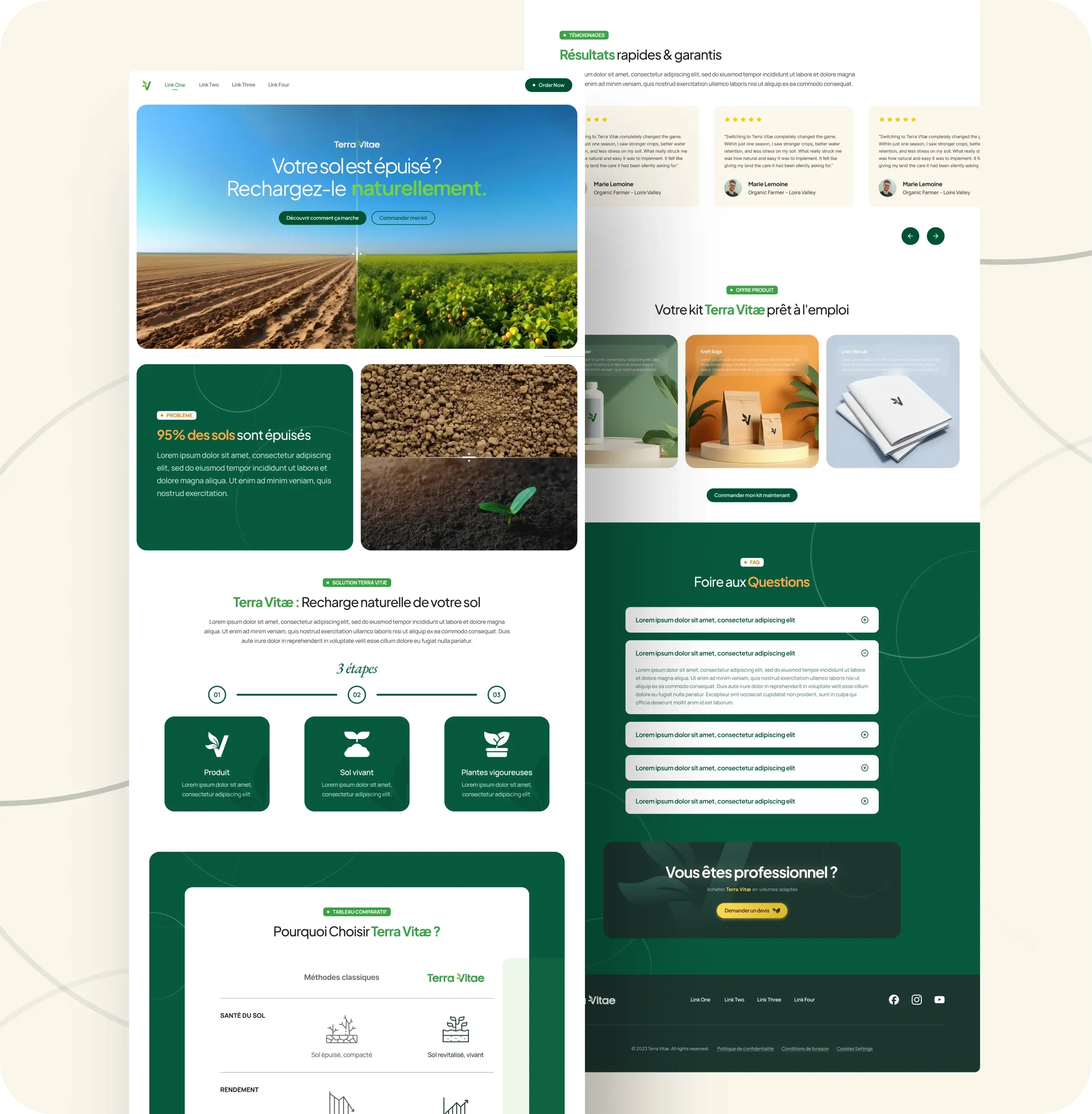
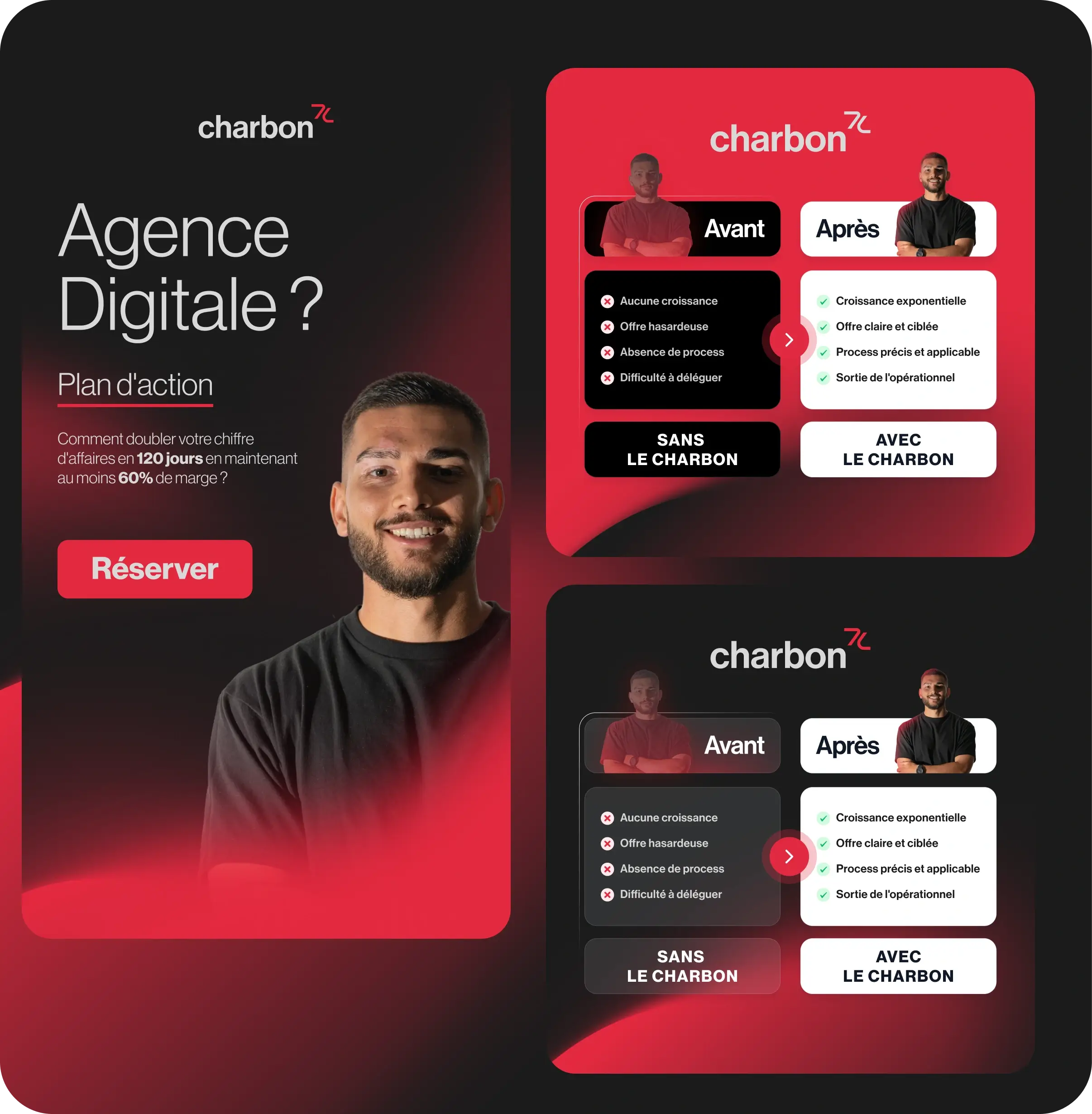
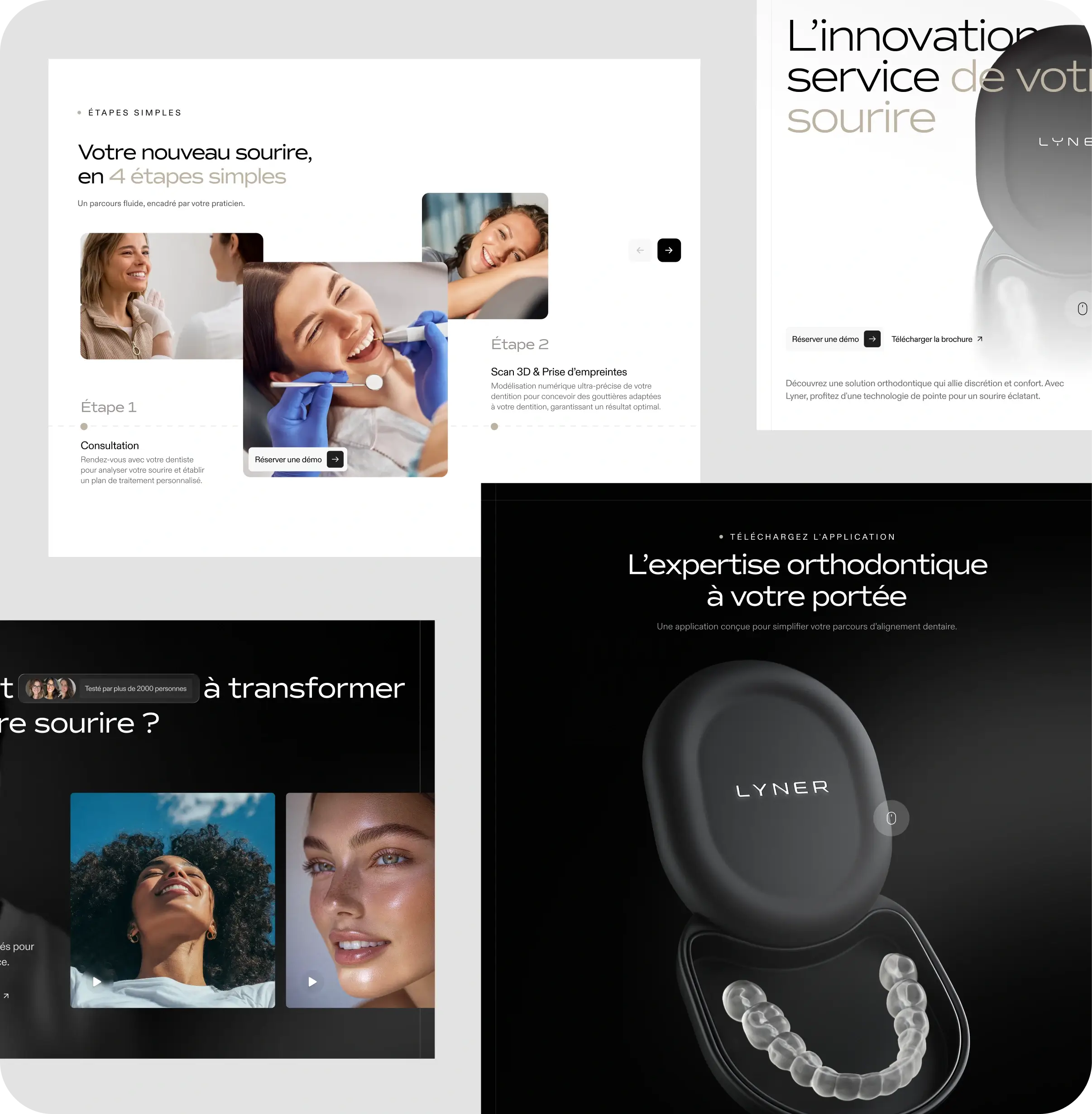
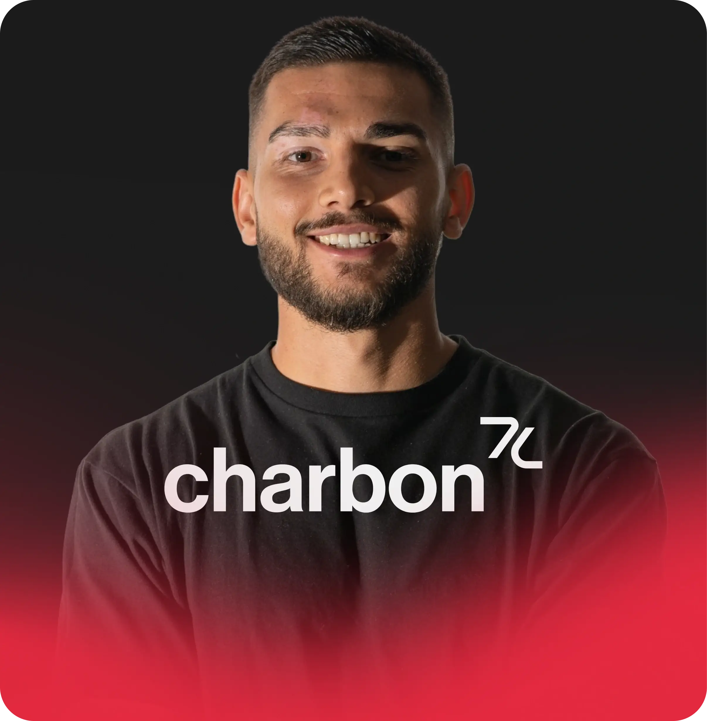
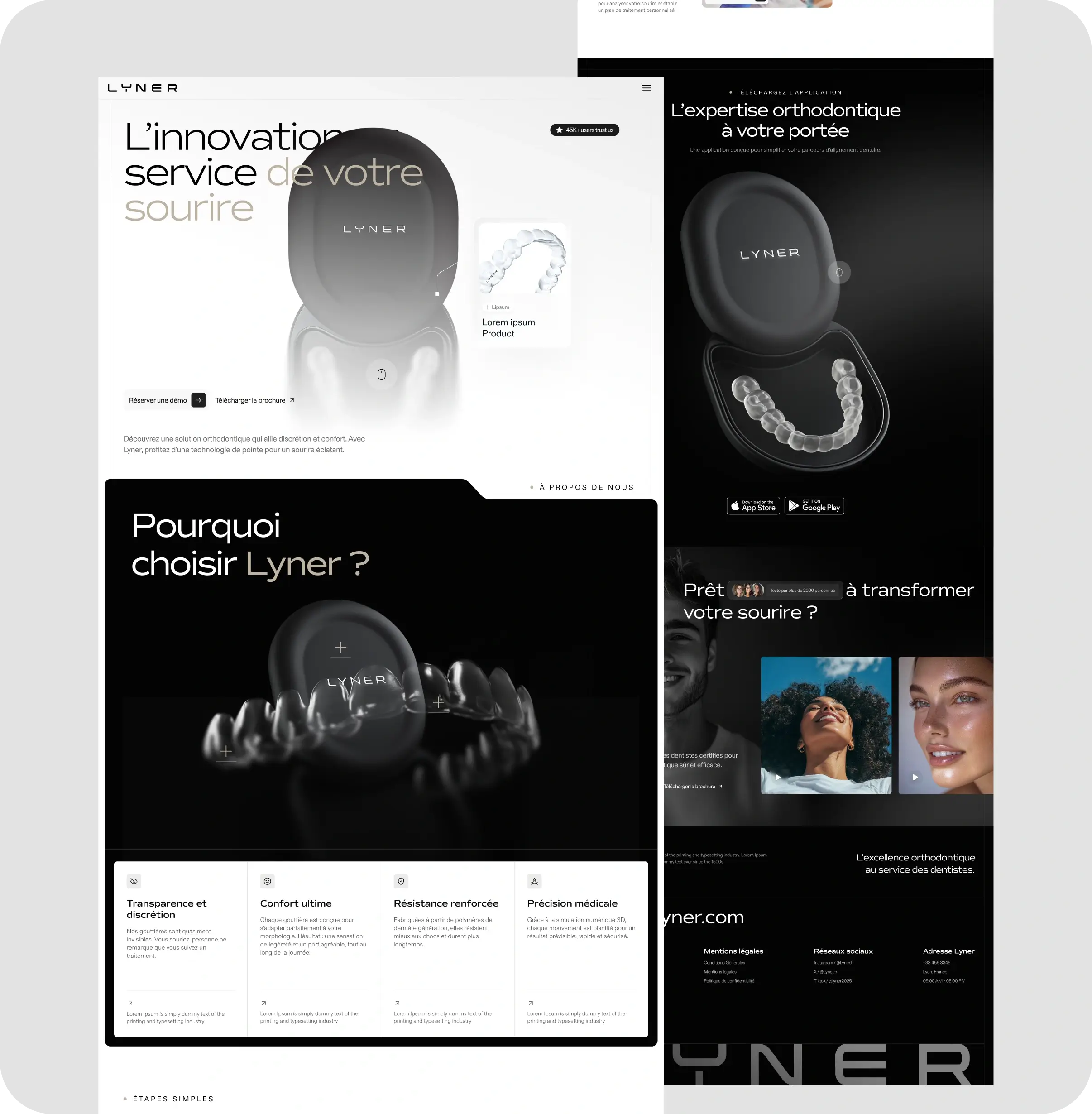
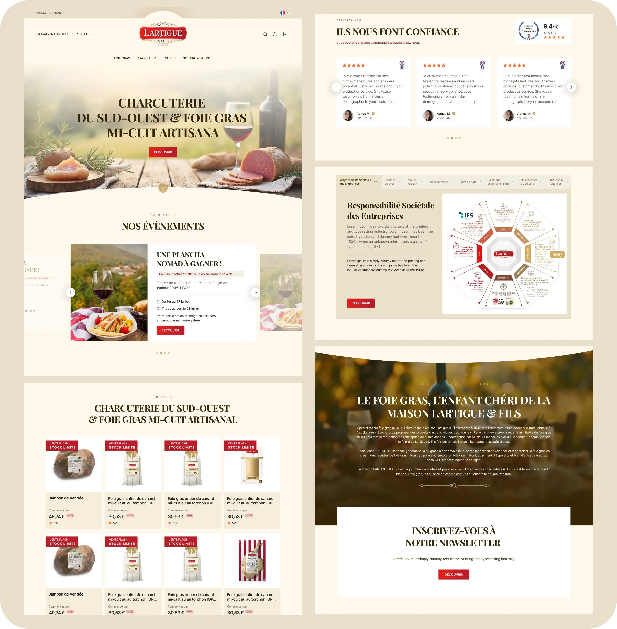
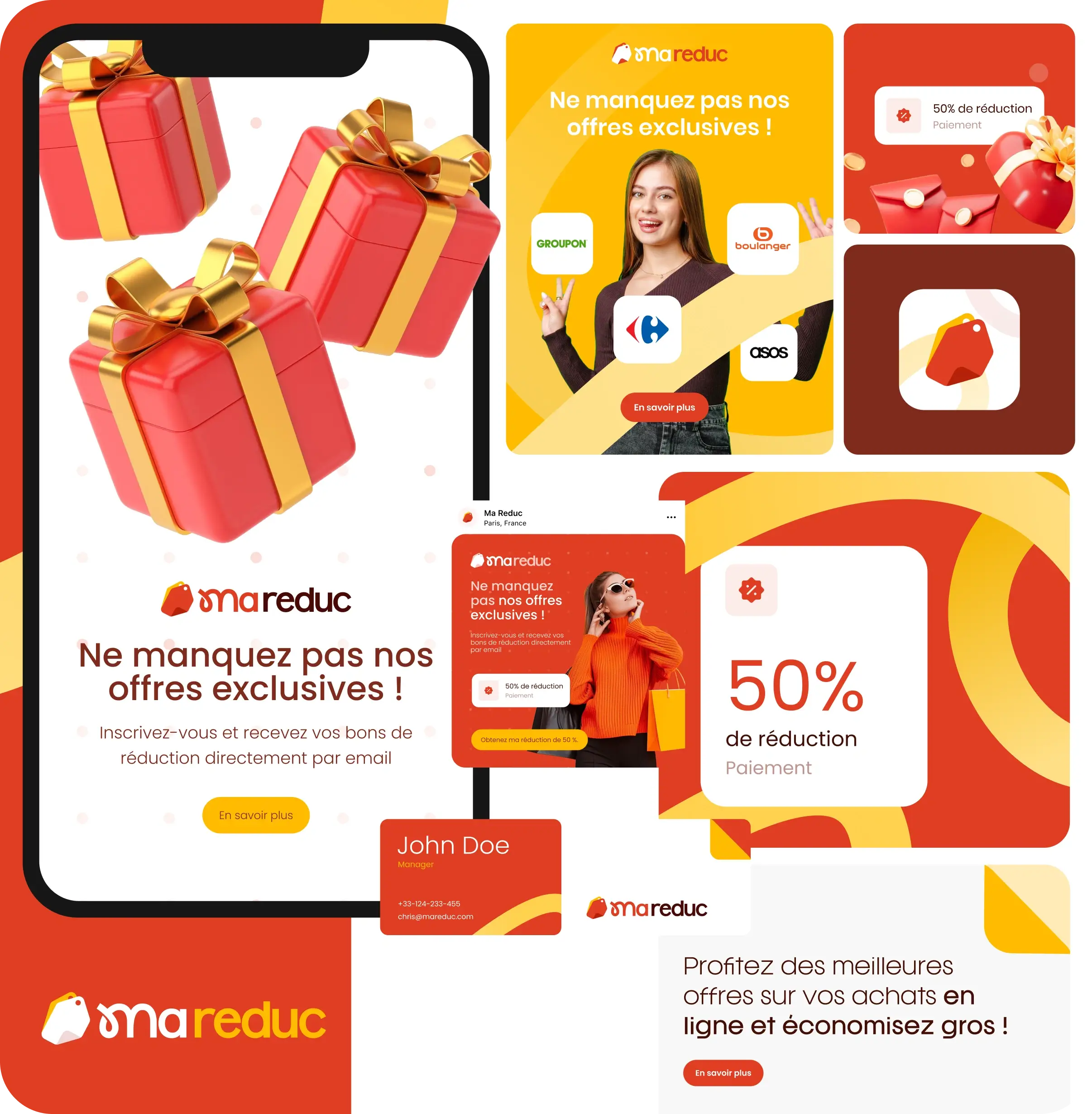
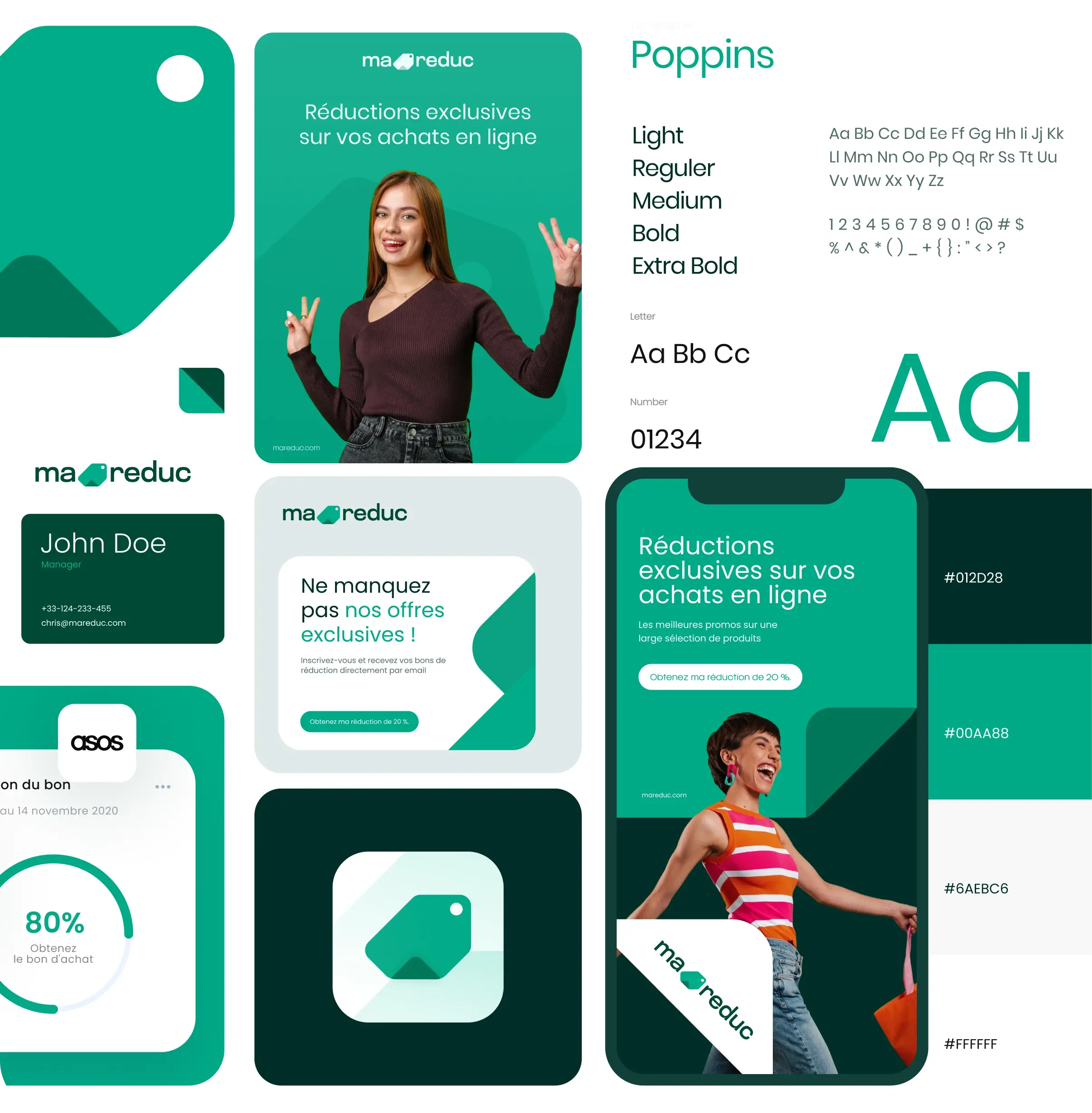
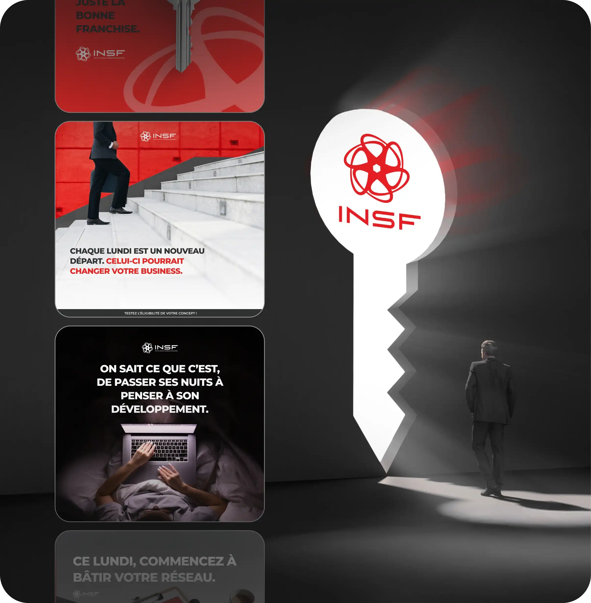
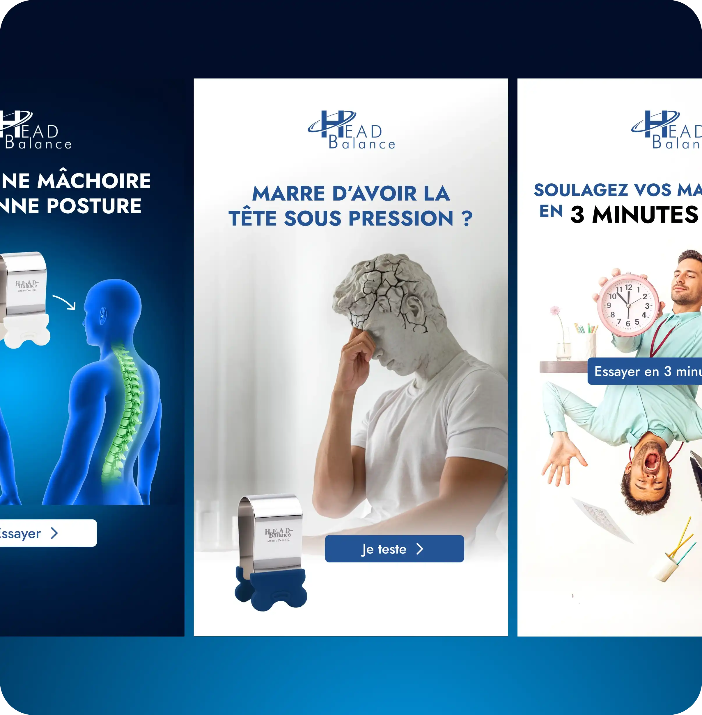
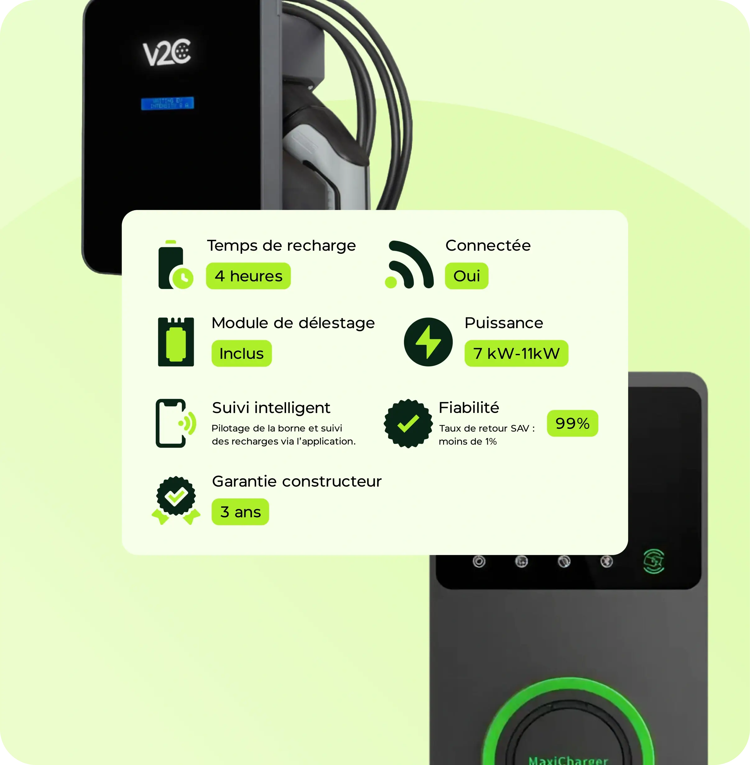
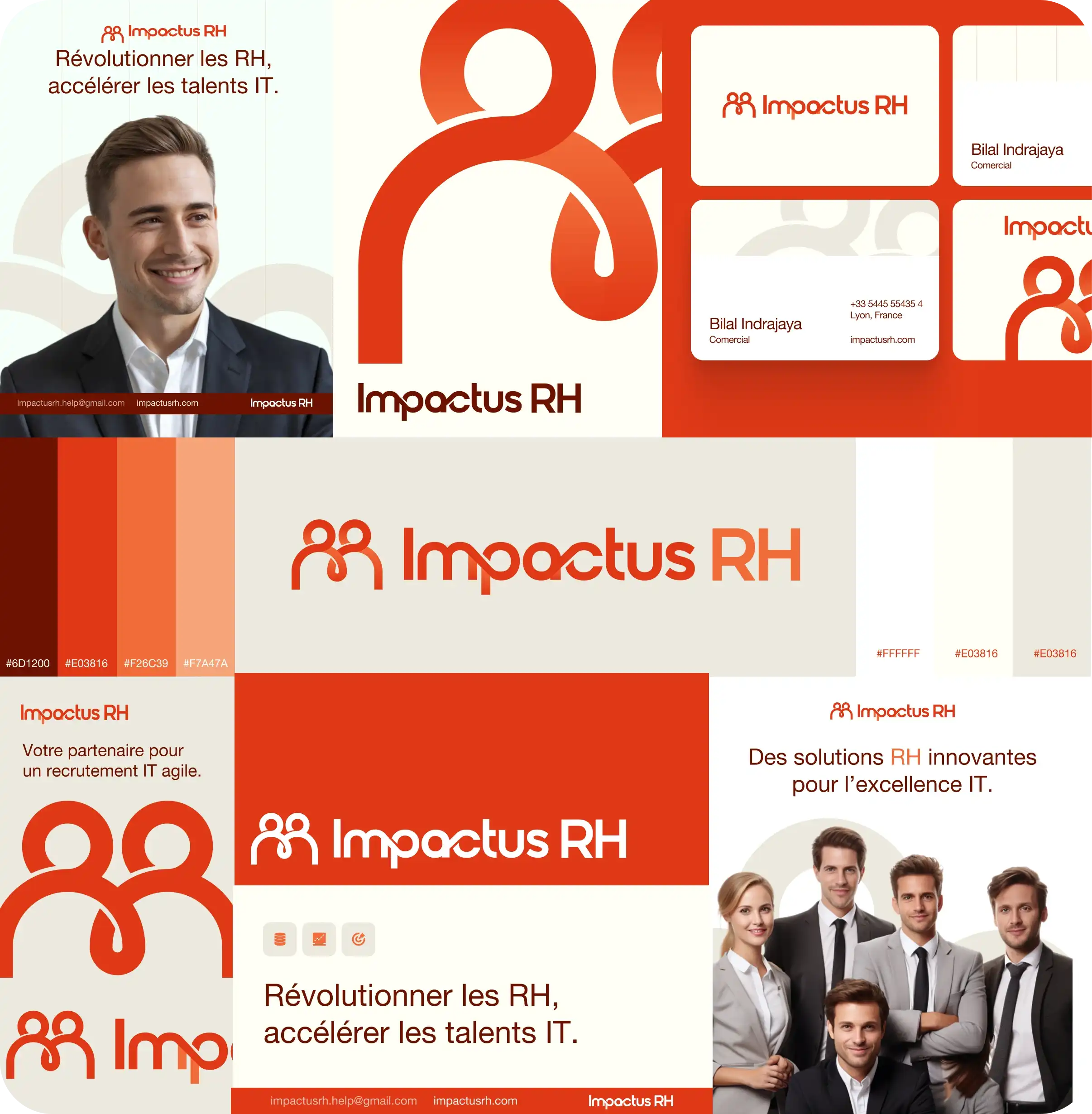
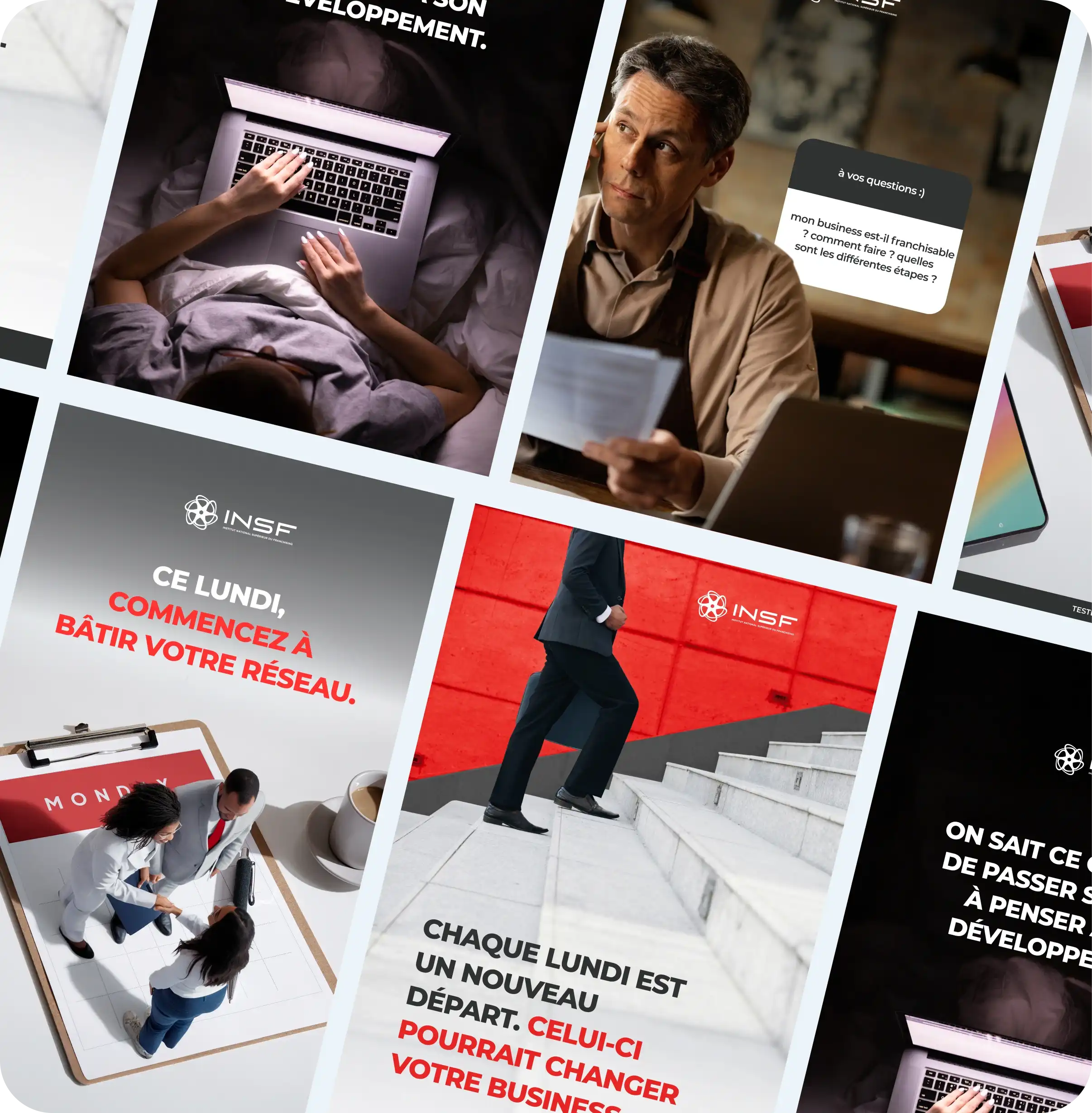
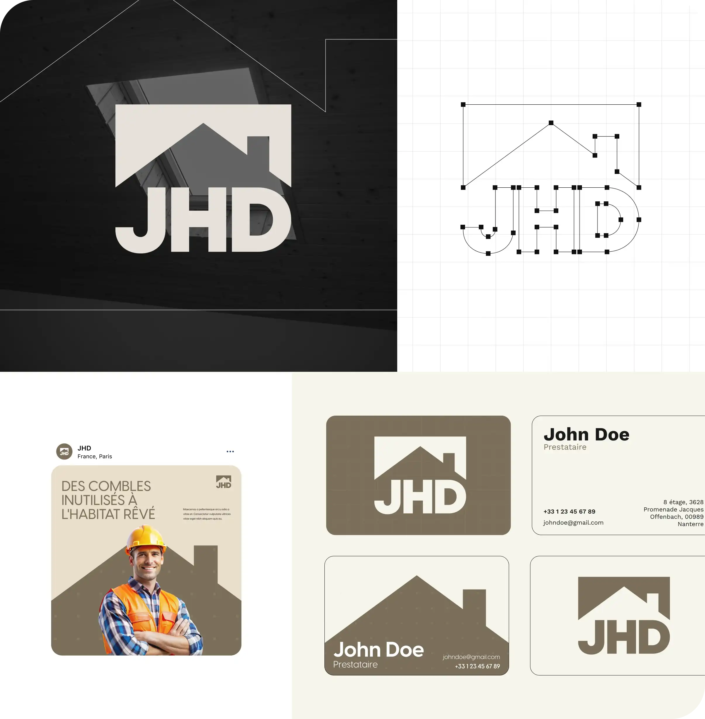
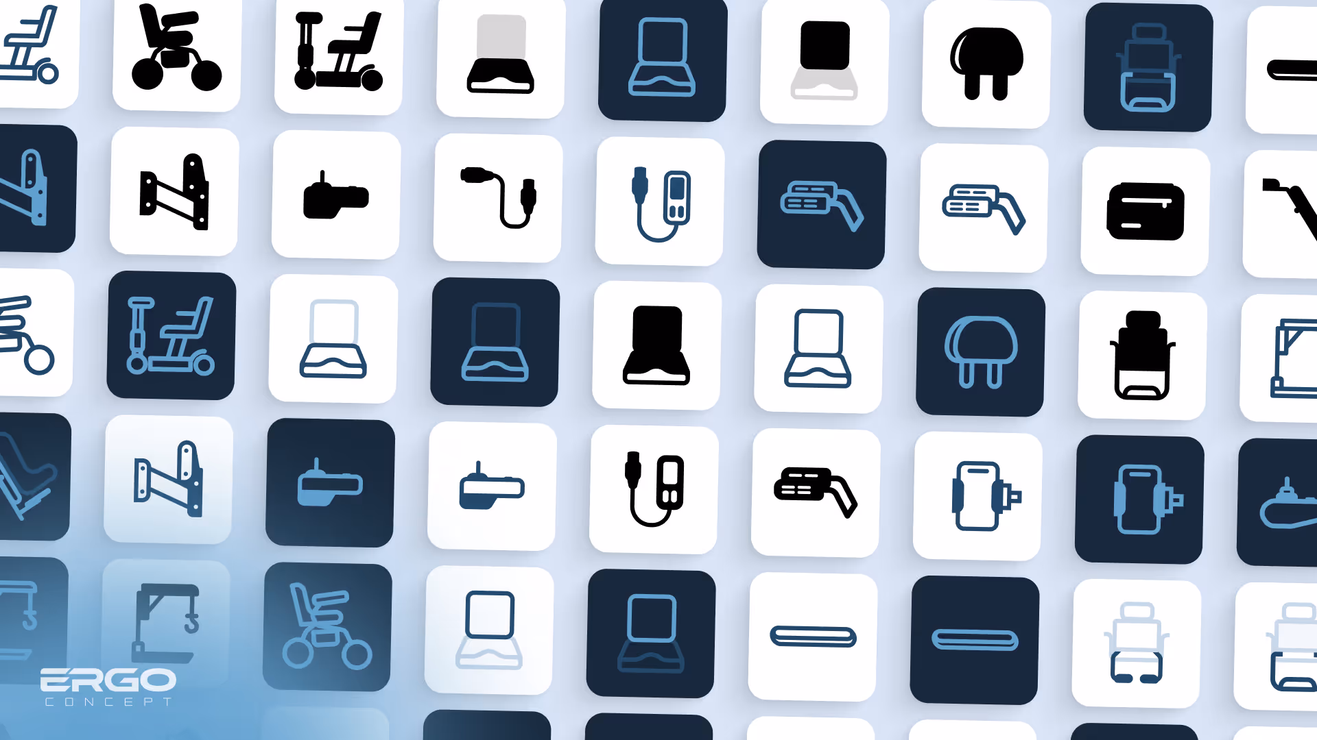
We modernized their logo, redesigned those of each product, proposed web layouts, email templates, business cards, ads, iconography and product photomontages.
All in a style consistent with their existing image.
Real precision work, at the service of their marketing team.
Unlimited requests, fast results
Submit as many briefs as you need. Our plans allow you to manage a continuous flow of design requests, without limits and without friction, and at an economic cost.
With Design Elite, Ergo Concept was able to tackle a visual transition phase all gently, without interruption. We worked from their existing logo to offer a more modern, more legible version, while maintaining its original structure and color.
At the same time, we reviewed all product logos, designed email and business card templates, created several advertising visuals and product photomontages. On the web side, we designed several sections of the site for simple integration by their webmaster under WordPress.
Our approach was clear: serve the marketing team, not replace it. Our deliverables allowed them to remain autonomous, fast and agile, with clean and usable source files.
Even though the customer had to pause the subscription for budgetary reasons, the collaboration was smooth, useful, and perfectly aligned.
They know they can count on us anytime — and we'll be there if the adventure resumes.


.avif)
.avif)