.svg)
What is the CSS clip-path property?
The clip-path property defines the visible region of an HTML element. It acts as a mask limiting the display area to a precise shape (circle, polygon, ellipse, etc.), cutting off everything outside it. It makes advanced visual effects possible without editing images or using external graphic masks.
In short, clip-path sculpts the visible area of an element directly in CSS, giving you far more design freedom.


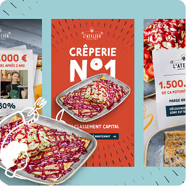



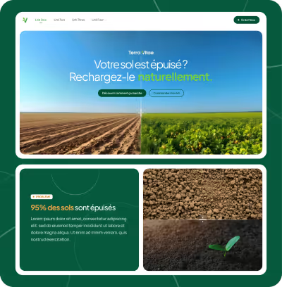














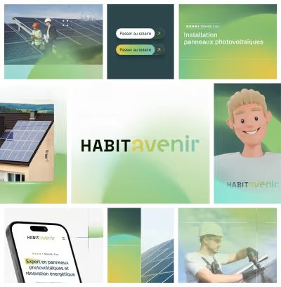









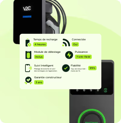
























Unlimited requests, fast results
Submit as many briefs as you need. Our plans allow you to manage a continuous flow of design requests, without limits and without friction, and at an economic cost.

How does clip-path work?
The principle is simple: you define a geometric shape that acts as the visible region. Everything outside that geometry becomes invisible (much like a mask).
The most common shapes are:
circle(): a circular zone defined by a radius and a center.ellipse(): an ellipse with horizontal and vertical axes.polygon(): a polygonal shape from a list of points.inset(): a rectangle with internal offsets (to simulate a rectangle smaller than the element).path(): a complex SVG vector shape, for advanced custom clips.
Images can also be used as masks, but that is a separate technique.
Syntax and examples
These examples show how easily the apparent shape of a block or image can be changed.
Support and compatibility
The property is widely supported in every modern browser:
- Chrome, Firefox, Safari and Edge support
clip-pathwith a range of values. - Internet Explorer does not support it, so plan an alternative or a fallback.
- Advanced values such as
path()can be limited depending on the version.
The -webkit- prefix is recommended for Safari and older Chrome versions when broad compatibility matters.
Practical applications
Things to watch
- The clipped content stays in the DOM — it is not removed, so it can still receive focus or clicks depending on the shape.
- Accessibility needs attention, since the visible shape is not necessarily the focus area.
- Animating
clip-pathis possible but can be resource-hungry depending on the shape's complexity. - Some design tools and frameworks do not handle
clip-pathnatively and may need a polyfill or fallback.
Unlimited requests, fast results
Submit as many briefs as you need. Our plans allow you to manage a continuous flow of design requests, without limits and without friction, and at an economic cost.
Conclusion
The CSS clip-path property is a powerful, flexible tool for creating original, personalised visual effects by clipping the visible area of an HTML element to a chosen geometric shape. Easy to adopt and performant, clip-path has established itself as a go-to technique for modern, dynamic interfaces, all through a simple syntax. Its wide adoption in web projects speaks to its value in contemporary web design.
Key takeaways
- The concept in brief:
- Definition: clip-path is a CSS property that defines a clipping region (mask) for a graphic element.
- Main purpose: it hides everything outside the defined shape, producing custom-shaped images, divs and other elements.
- Possible shapes: polygons, circles, ellipses, inset rectangles, and complex SVG paths.
- Browser support: broad modern support, but watch out for older versions and a few specific limitations.
Unlimited requests, fast results
Submit as many briefs as you like. Our plans let you manage a continuous flow of design requests, without limits or friction, and at an economical price.