.svg)
What is a serif?
A serif is the small stroke or foot that projects from the end of a letter's main strokes in certain typefaces. Typefaces built with these strokes are called serif typefaces, and those without them are called sans serif, from the French word for without.
Serif typefaces fall into a few named groups, each tied to a period of type design. Old Style serifs, such as Garamond, have angled stress and modest contrast between thick and thin strokes. Transitional serifs, such as Times New Roman, sit between old and modern styles with straighter stress. Modern or Didone serifs, such as Bodoni, push contrast further with thin hairline serifs and near vertical stress. Slab serifs, such as Rockwell, use thick, block-like serifs with little to no taper.
Serif typefaces have been the default choice for printed body text since the invention of movable type, because the strokes are thought to help the eye track along a line.























































Unlimited requests, fast results
Submit as many briefs as you need. Our plans allow you to manage a continuous flow of design requests, without limits and without friction, and at an economic cost.

Do serifs actually improve readability?
The research on this question is mixed and depends heavily on the medium. Serifs were long credited with guiding the eye along a line of printed text, which is why newspapers, books, and academic papers still default to serif body text. On screens the picture is less clear, since early low resolution displays rendered fine serif details poorly, which is part of why sans serif fonts became the default for user interfaces.
- Serif definition: a small stroke at the end of a letter's main strokes.
- Serif meaning by era: Old Style, Transitional, Modern, and Slab describe when and how each style developed.
- Serif vs sans serif: the presence or absence of that stroke is the main structural difference.
- Common serif fonts: Times New Roman, Georgia, Garamond, Baskerville, Bodoni.
| Aspect | Serif | Sans serif |
|---|---|---|
| Stroke ends | Small foot or stroke | No added stroke |
| Common examples | Times New Roman, Garamond | Helvetica, Arial |
| Typical use | Print body text, formal documents | Screens, interfaces, modern branding |
Unlimited requests, fast results
Submit as many briefs as you need. Our plans allow you to manage a continuous flow of design requests, without limits and without friction, and at an economic cost.
Where serif typefaces show up in real projects
- Print body text: books, newspapers, and long-form print pieces still favor serif fonts such as Garamond or Georgia because designers trust them for extended reading.
- Editorial and publishing brands: mastheads and headlines often use a serif to signal authority and tradition.
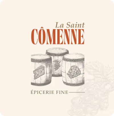
- Luxury and heritage branding: serif logotypes, often Modern or Transitional styles, communicate craft and permanence.
- Academic and legal documents: Times New Roman and similar serifs remain the standard for formal written work.
Key takeaways
- Serif in brief:
- Simple definition: a serif is the small stroke at the end of a letter's main strokes.
- Main styles: Old Style, Transitional, Modern (Didone), and Slab.
- Example fonts: Garamond, Times New Roman, Bodoni, Rockwell.
- Typical use: print body text, editorial branding, and formal documents.
Unlimited requests, fast results
Submit as many briefs as you like. Our plans let you manage a continuous flow of design requests, without limits or friction, and at an economical price.